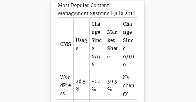
HTML tables, once commonly used for webpage layouts, are now a layout headache for many web designers. Tables often work best with fixed widths, which means they can wreak havoc on otherwise pixel-perfect responsive website designs. So what’s a WordPresser to do?
The first thing to do with tables is to use them sparingly. Tables should be used for tabular data and nothing else.
Not sure if a table is a right option for a specific data set? Put it to the spreadsheet test. Would this data make sense presented in a spreadsheet?
If so, an HTML table is an appropriate choice. If not, consider using a list or some other element to present the data.
Once you’ve identified a table as the best option, what then? Make sure it renders beautifully regardless of the size of the device viewing the table. Easier said than done, right?
Fear not. In this tutorial, you’ll learn about five different tools you can use to make HTML tables beautifully responsive.
Continue reading, or jump ahead using these links:
How WordPress Handels Tabels Make Tables Responsive Manually Using a Plugin to Create a Table Which is the Right Option for You? How WordPress Handels Tabels
There isn’t a straightforward answer to that question. The way tables are presented in WordPress varies from one theme to the next because table styling is handled by the CSS that ships with each theme.
So tables are rendered according to the CSS rules included with the active theme. Switch themes and the way tables are rendered will change.
Some themes have better built-in support for responsive tables than others. TwentySixteen, for instance, does a pretty good job of dealing with tables as long as they only have two or three columns filled with short bits of
Keep reading this article on wpmudev.org


